Designing an assessment authoring application for online learning
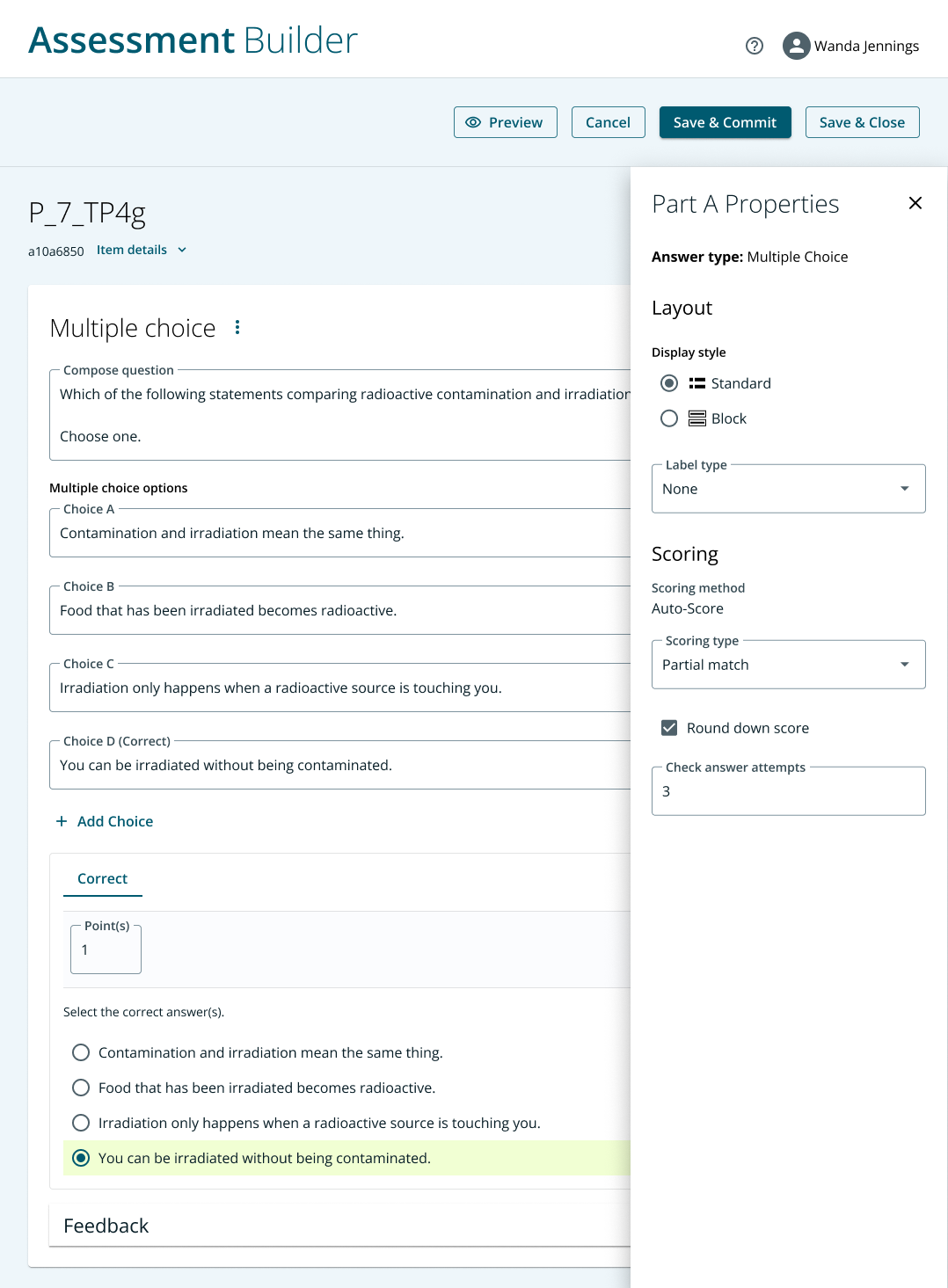
Screenshot of a small part of the assessment authoring multiple choice interface. (See bottom of the page for additional screenshots; I replaced the name of the application to maintain the privacy of the organization.)
What: Pearson, a global online learning provider, wanted to improve the user experience of an in-house assessment authoring application. The application was used by teachers and subject matter experts across the globe to build quizzes and tests for their students.
Why: Some Pearson users had adopted a third party solution to author their assessments. But we wanted all users to build their assessments on the same platform for a number of reasons:
In order to meet our users needs we customized the third party solution. But since we didn’t own the software our customizations required workarounds that eventually affected the performance of the application. We wanted more control over the application in order to make it what our users expected.
We wanted to improve the usability issues that we found via user interviews and surveys that I led from this study.
We wanted to save the yearly licensing fees of the third party application.
The assessment application had been designed years earlier without the benefit of a UX designer. We wanted to update the experience with more modern thinking and align the application to our new design system.
How:
My part of this project was the authoring application—the part that teachers use to input questions. The student-facing interface was handled by another designer on my team. We worked closely to make sure both applications were aligned and functioned consistently.
Prior to starting this project I conducted user interviews and collected surveys from users to understand the pain points of the existing application. Fortunately that knowledge put me in a good position to understand much of how users were interacting with the application.
Since there were some questions about functionality requirements I started the design phase with wireframes to make sure we were capturing the right functionality before moving to visual design. I presented them to the internal stakeholders and others in the business who would be using the assessment application in order to ensure we had captured the full breadth of requirements.
The first part of the project that I redesigned was the Multiple Choice authoring interface. Given that there were 50 question types in total, we decided to start with the question types that were most often used, so Multiple Choice was the first UI we focused on.
Item authoring is a feature-rich experience containing many settings, so it was important to make authoring easy for first-time users while giving advanced users easy access to tools that they need. My team’s strategy was to show the tools used most often and set reasonable default values to allow users to quickly author multiple choice questions without a lot of bells and whistles. We located more advanced, less often used settings behind icons and in show/hide panels.
Outcome:
A redesigned user interface for Multiple Choice and Fill-In-The-Blank authoring which I delivered to the developers via Figma
A close working relationship with the users of the product: we modeled the interface on what they wanted the application to do and established a productive long-term working relationship with them where there had been little connection before.
A strong start on the long project to rebuild all 50 question types. My team established a process and design standards that should be applied to all 50 question types.


